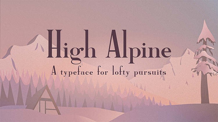
High Alpine Font

illustrated snowy mountainous landscape with High Alpine font preview

I found myself once again unable to find a font that fit the bill for what I wanted for a map title. Also it is just really fun making fonts. I’ll write more about the inspiration for this font, and add a downloadable version for everyone to use. For now, here are some previews of the High Alpine Font.

High Alpine font is a semi-bold serif display font. It has an unapologetically high ascender with no accompanying adjustment to the x-height. The descender was kept rather short as well, allowing uppercase to maintain its towering command. High Alpine includes many alternative characters; uppercase barred characters have alternatives with daringly high crossbars, and stemmed lowercase characters have longer-stemmed alternatives.

Image showcasing the 'High Alpine' typeface by Sarah Bell, featuring examples of uppercase and lowercase letters, numbers, accented characters, and punctuation. The background includes a scenic view of tall cedar forests and a rustic cabin.
Examples of the characters in High Alpine. There are many alternative characters within the font. I took this photo at the beginning of the Covid-19 pandemic in Anacortes, Washington on the shores of the Guemes Channel.
A small preview of the High Alpine font over a photo I took while standing at the Diablo Overlook in North Cascades National Park.
A small map of Bergen, Norway I created in Adobe Illustrator. The fonts used on this map are BellTopo Sans and High Alpine.
A display of all the characters and alternative characters you can find in High Alpine font.