
My Favorite Map Animation Workflow & Essential Resources
Discover 7 key tips for diving into After Effects as a mapmaker
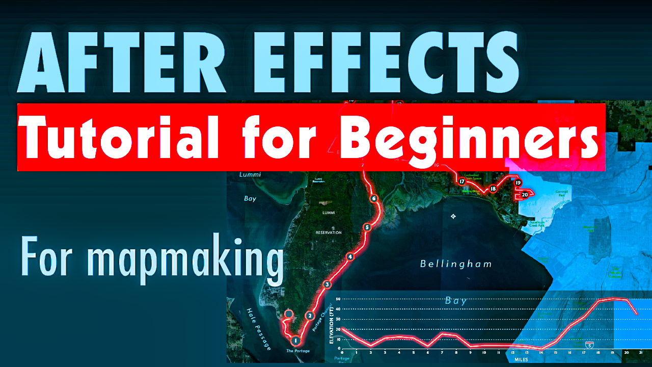
Discover 7 key tips for diving into After Effects as a mapmaker

This interactive visualization toggles between two perspectives—changes in voter turnout from 2020 to 2024 and each state’s variance from the national average—transforming static election data into an engaging, dynamic experience.

America has low voter turnout, and the last general election was no exception. Only 64% of voter eligible Americans casted their ballots in 2024. This means that 90 million Americans who were eligible to vote didn’t show up to the polls. This two-page data visualization shows this drop state by state.

Announcing a new Adobe Illustrator tutorial series, beginning with how to make symbols and symbols libraries.
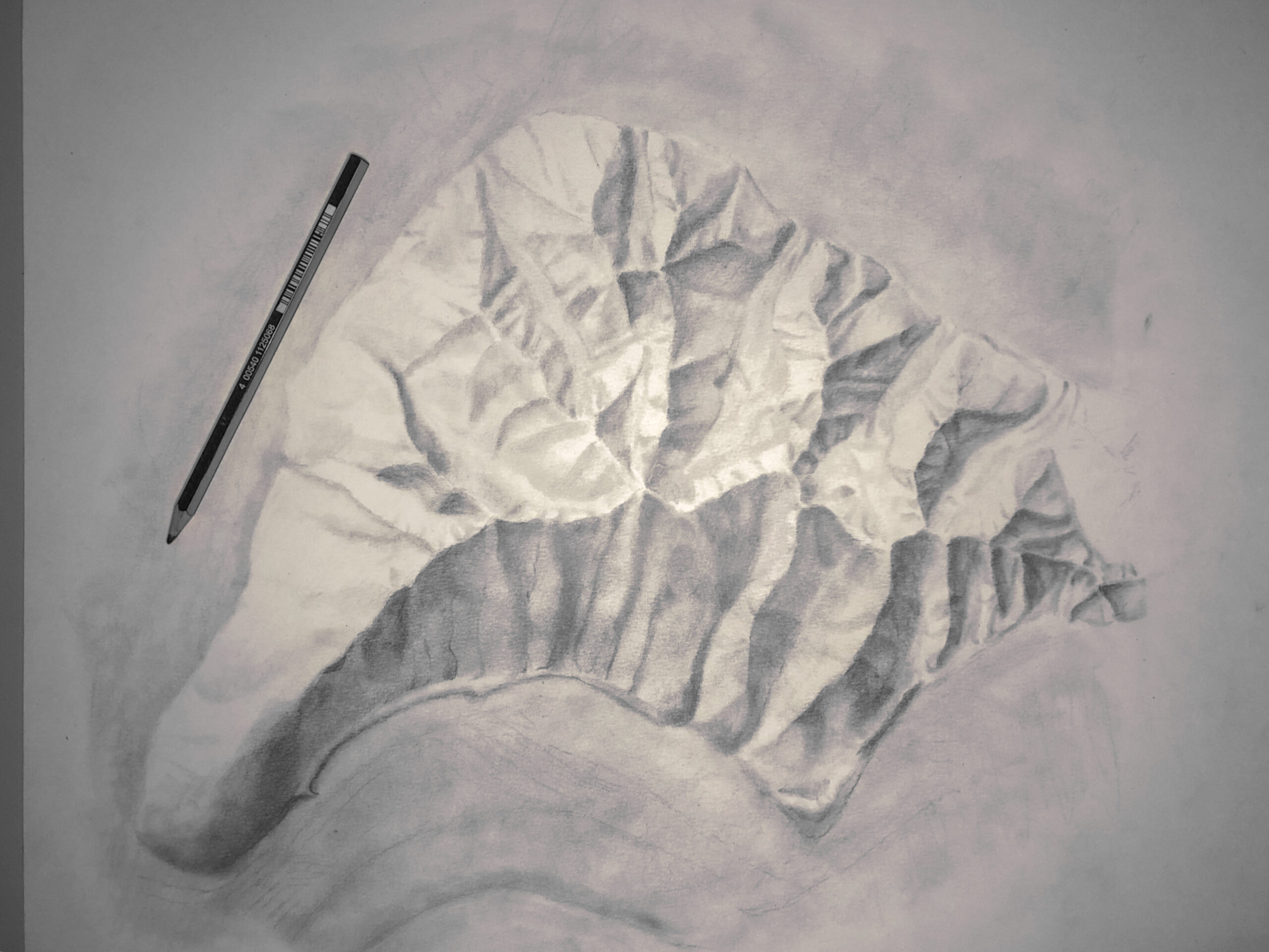
Learn how to hand draw beautiful shaded relief hillshades in this 6-step tutorial.
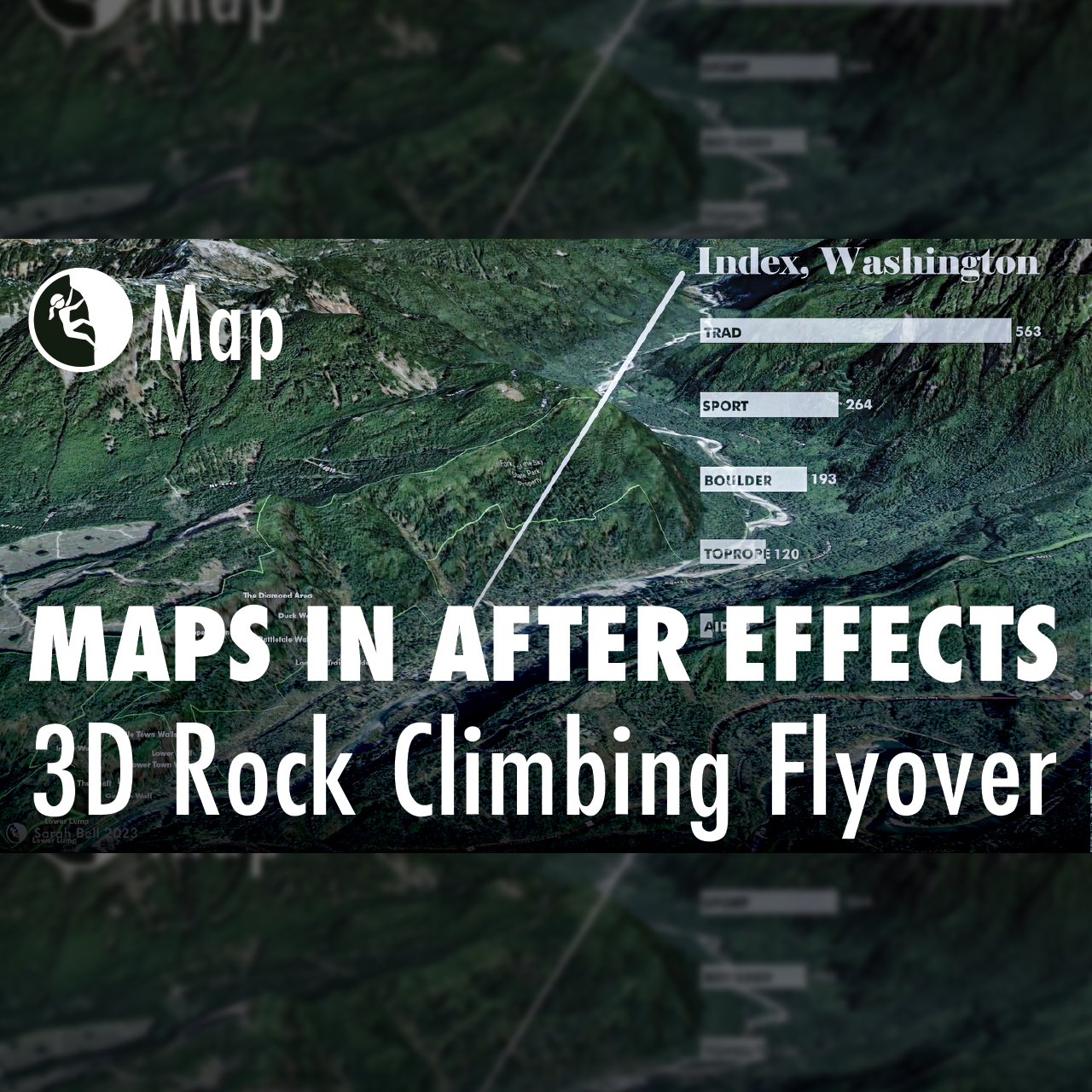
Building maps often requires multiple software applications. In fact, I cannot recall a map that I’ve made in the last decade that did not include using at least two different applications. For this map, I created a flyover animation in ArcGIS Pro. I then imported the animation (mp4) into Adobe After Effects, where I added…
Last week marked Esri’s annual User Conference in San Diego, and what a conference it was! It’s always fun to see geospatial friends and meet new ones. Part of my time at this year’s gathering was spent presenting alongside Kenneth Field and John Nelson for our talk entitled “Designing Thematic Maps.” This year, Ken had…
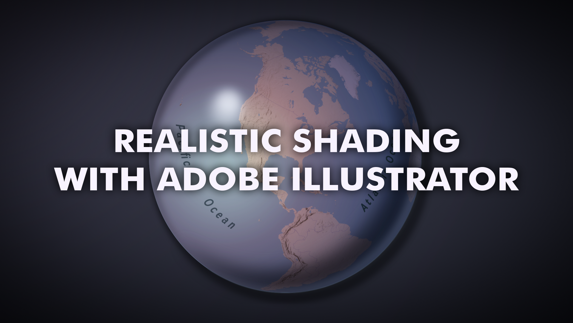
In a few quick steps, you can give a circle-shaped vector path a 3D-rendered appearance in Adobe Illustrator. I’m a cartographer – I make maps. So in the video posted below, I will use this technique on a globe of Earth. However, any graphic designer can use the video’s techniques for any time they want…
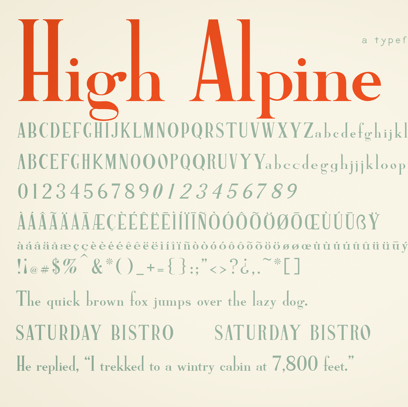
High Alpine Semibold has an unapologetically high ascender with no accompanying adjustment to the x-height. The descender was kept rather short as well, allowing uppercase to maintain its towering command. For moments when you designers feel like reaching ultimate heights, I’ve added many alternative characters; uppercase crossbarred characters have alternatives with daringly high crossbars, and stemmed lowercase characters have longer-stemmed alternatives. Many further glyphs are included with this font to accommodate multiple languages.
By the time I publish this, I will have just finished presenting at the 40th annual North American Cartographic Information Society (NACIS) conference. NACIS is a large community of map enthusiasts who meet once a year to share and learn about cartography projects. This year’s conference is being held virtually due to the current pandemic crisis.…